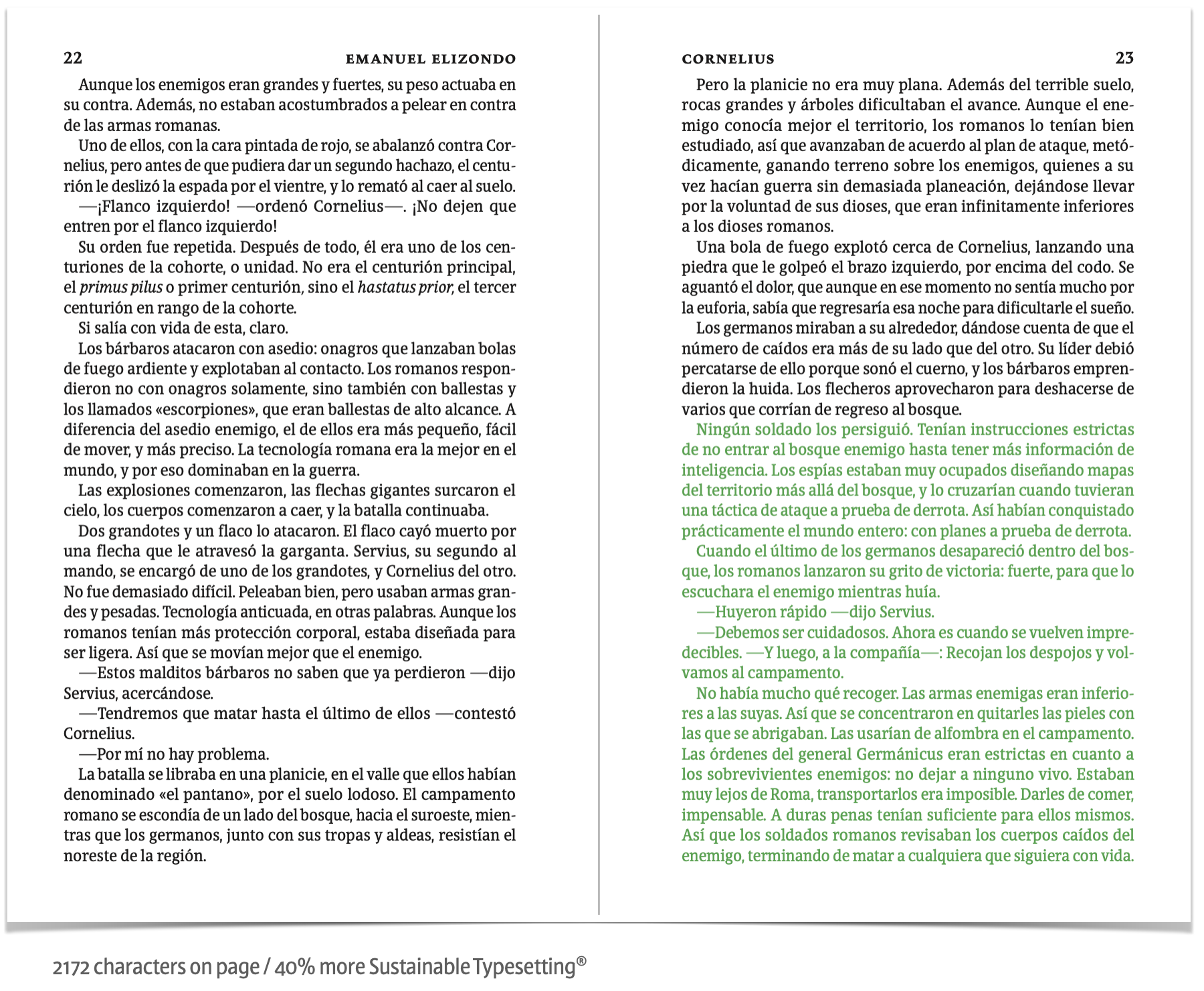
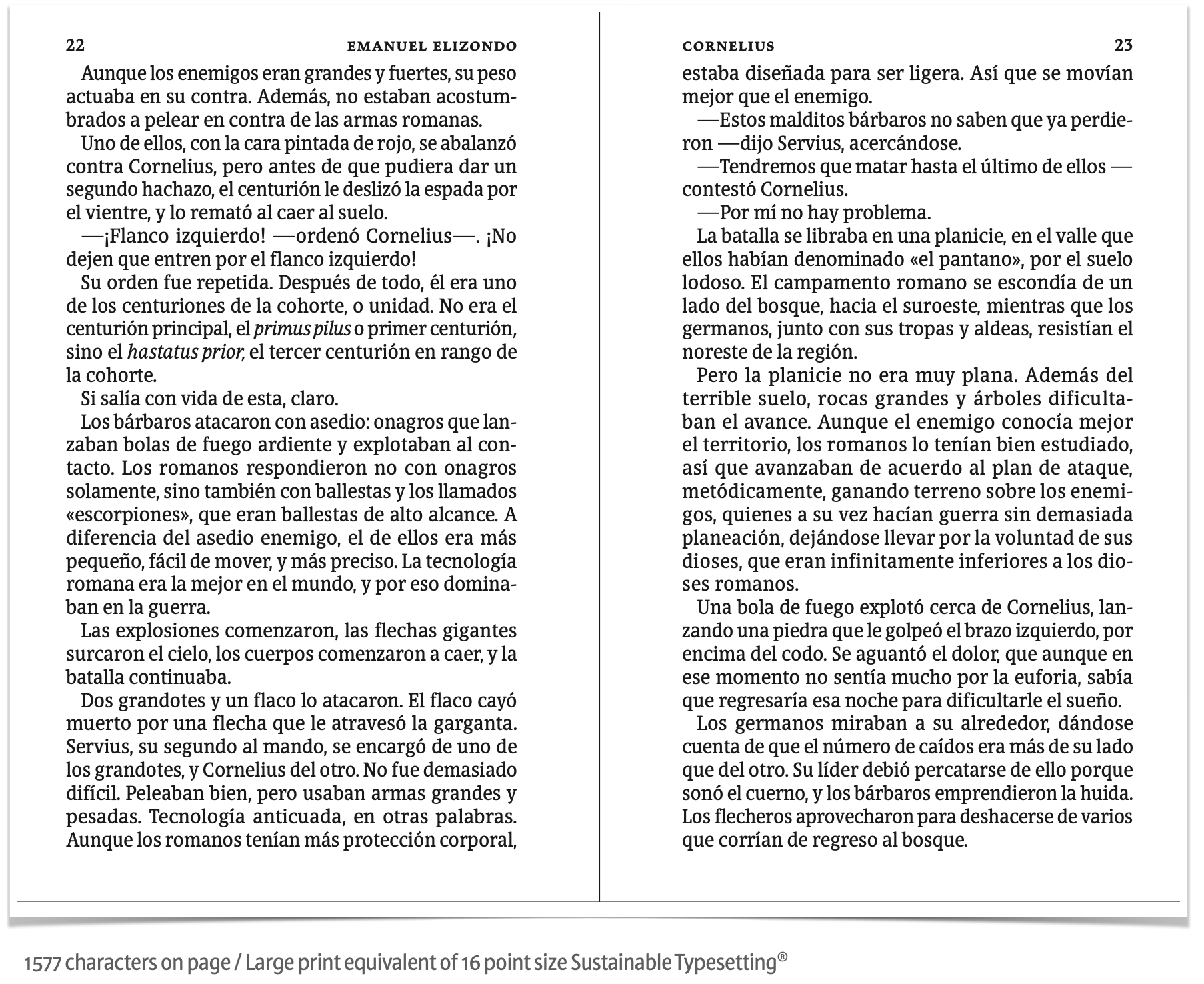
Readability
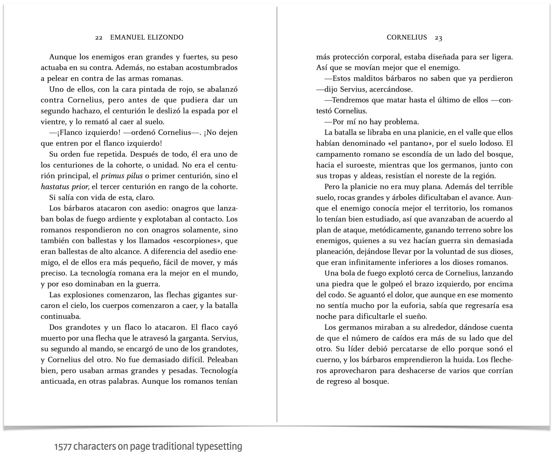
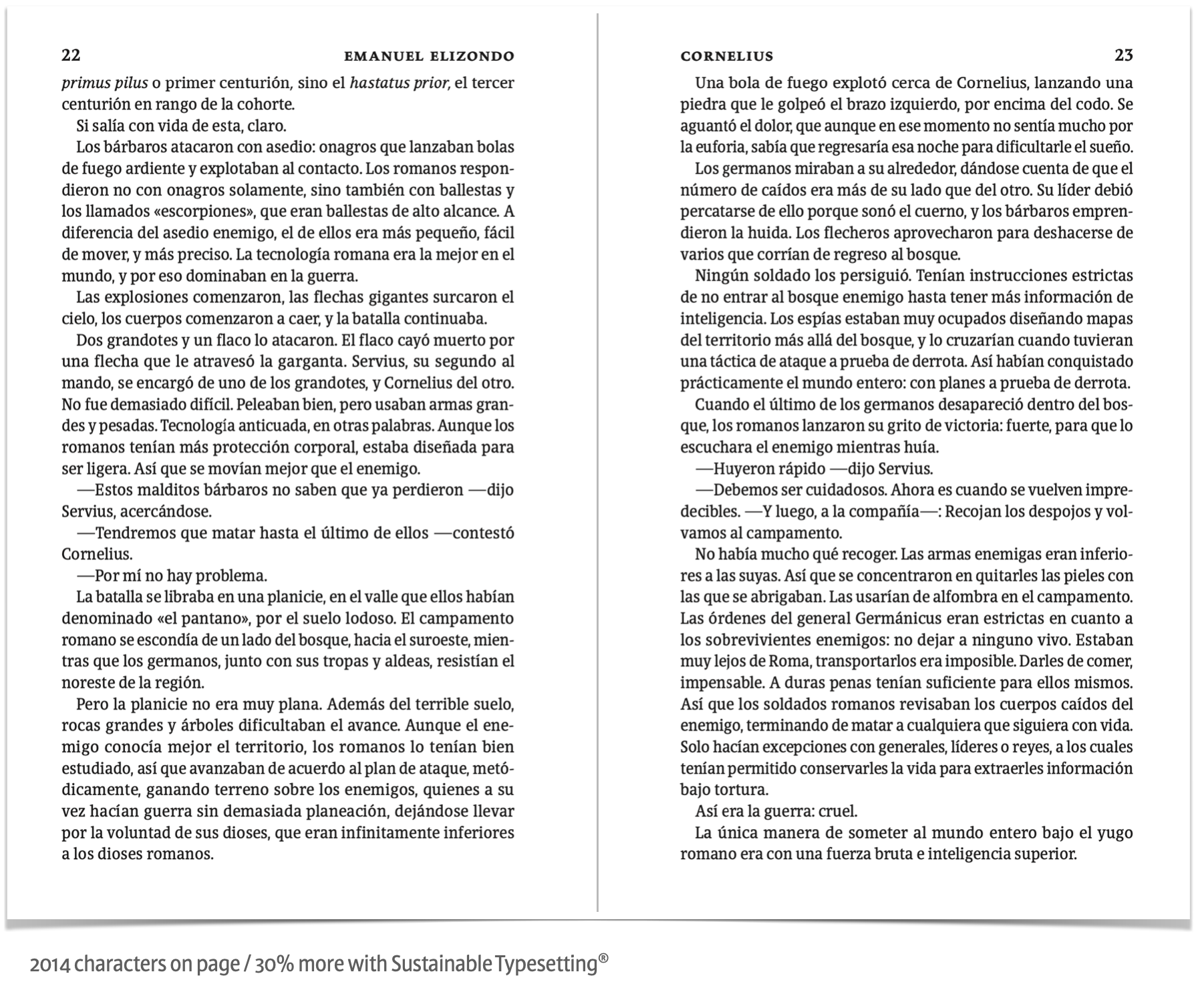
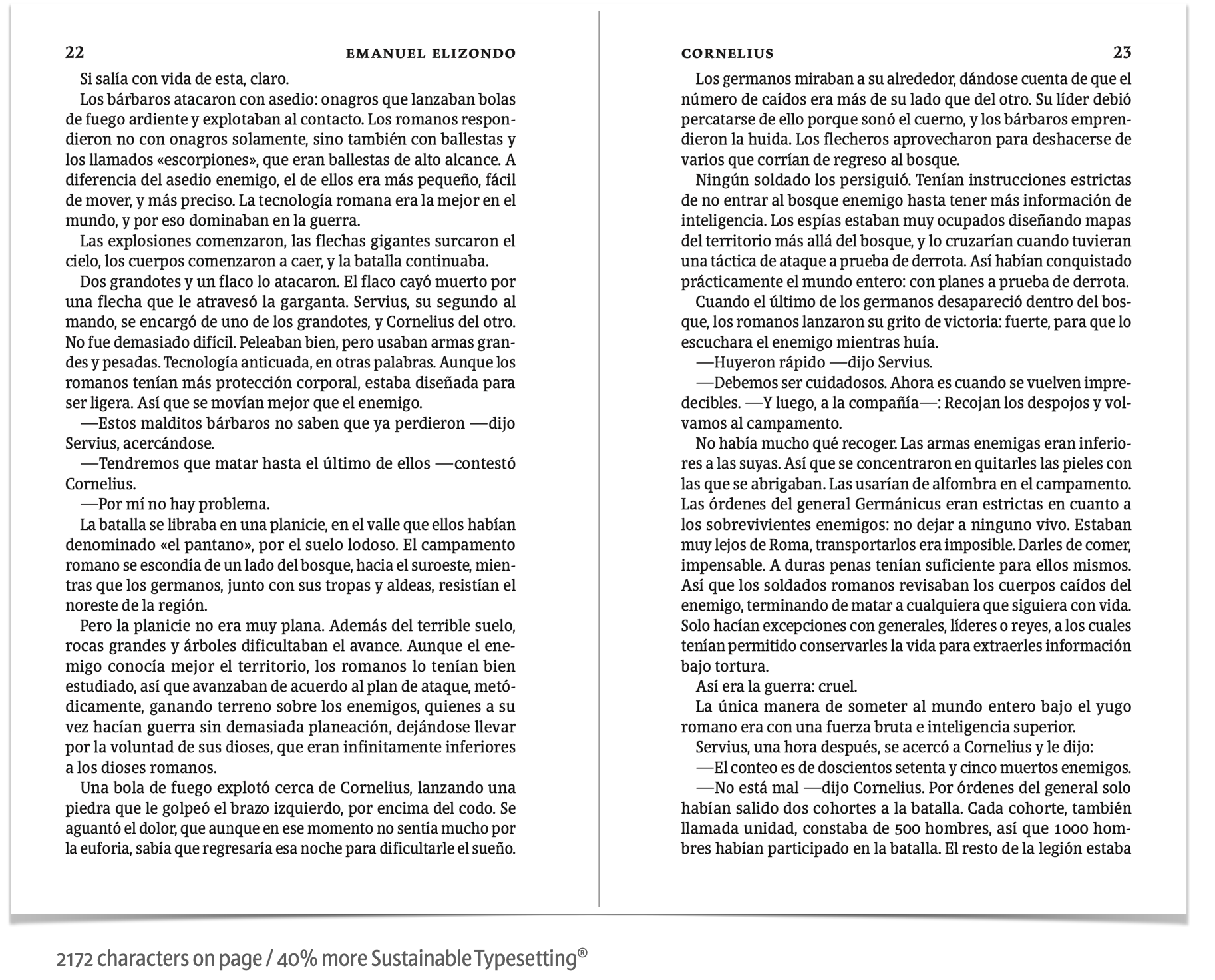
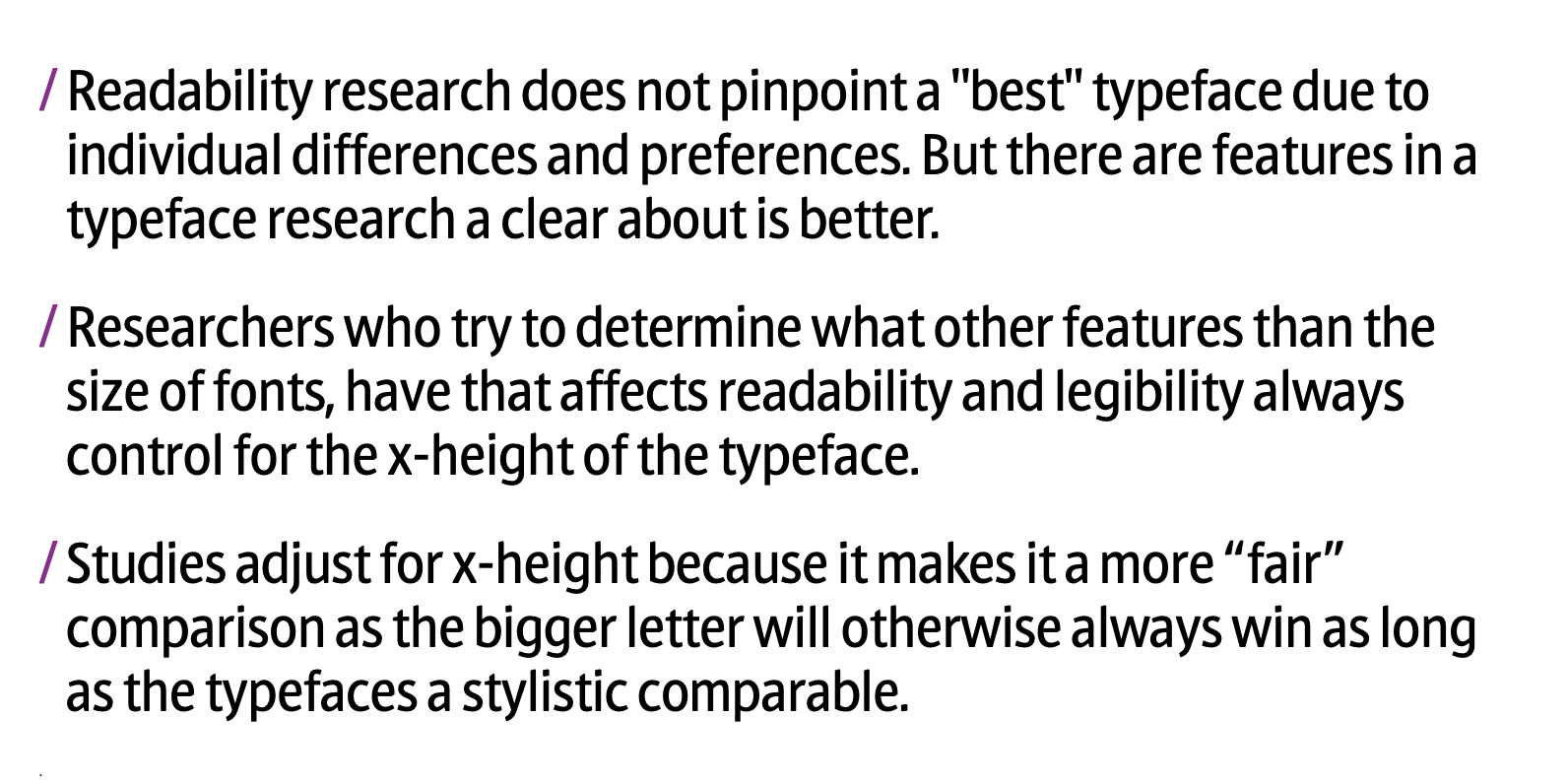
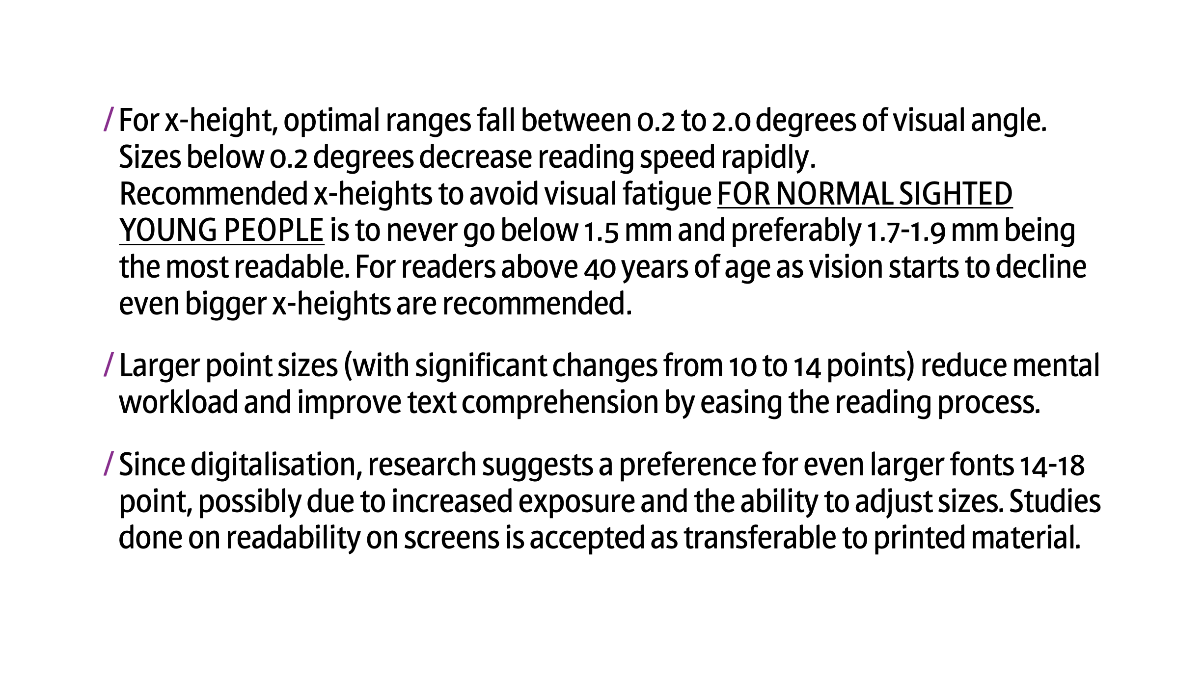
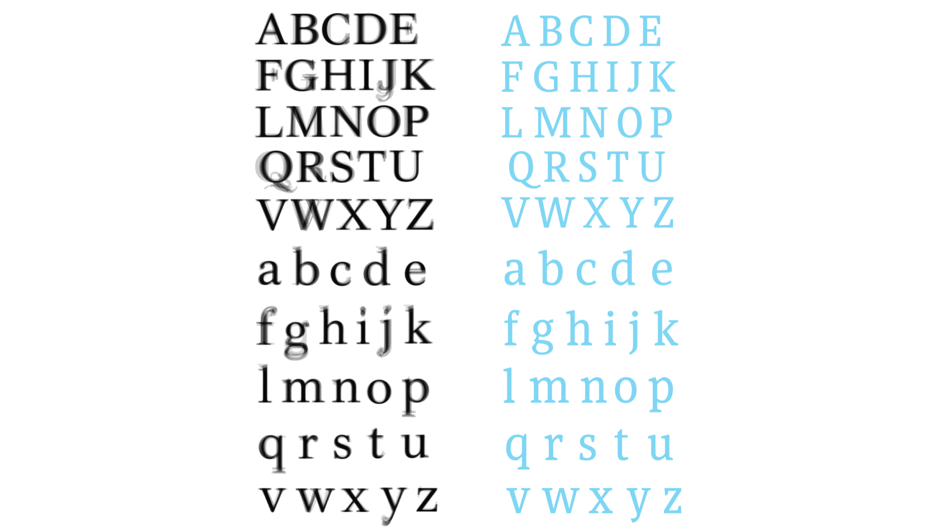
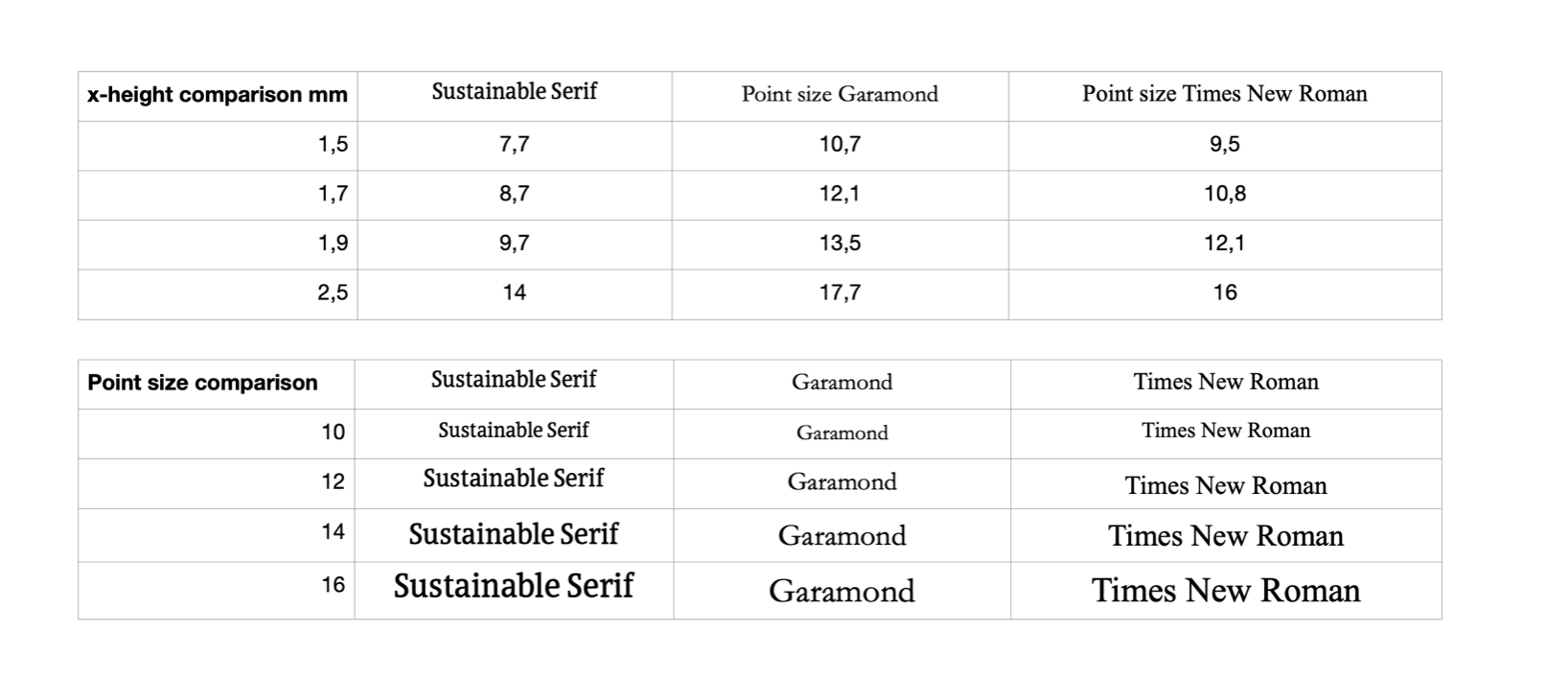
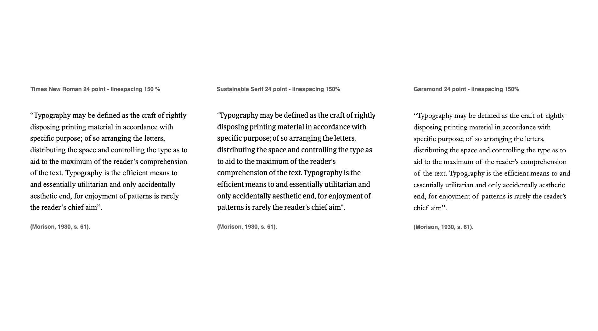
Our definition of increased readability is defined by the increased x-height as it is identified as the most significant factor in readability by scientific studies.
The UK association of accessible formats highlights x-height as the most correct term for ensuring readability compared to the term “point size”. “Point size” is however used because it is much more well known compared to the more specific typographic knowledge such as x-height.
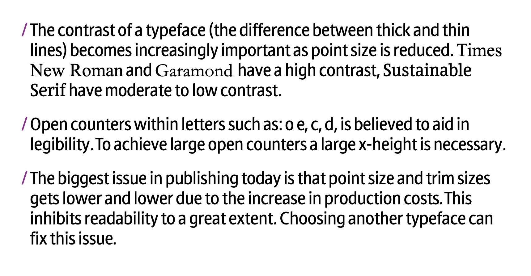
Our typeface design also ensures a moderate contrast in letter strokes which further increases readability accommodation normal and low vision readers.
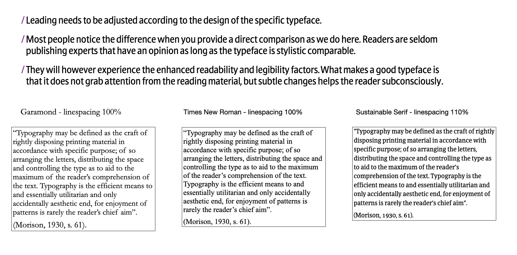
We are well aware that there are other factors like leading and tracking which we always optimise and never compromise on from a readability perspective.
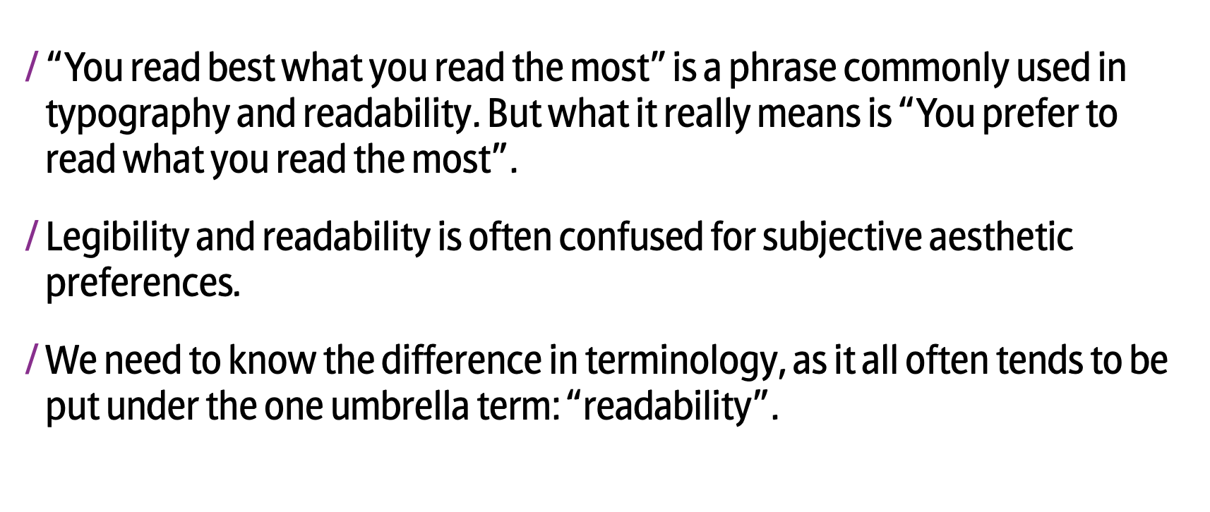
It is crucial to differentiate between subjective preferences and objective measurements. The “one thing fits all” does not exist in readability, but we can create products that accommodate and improve readability for as many readers as possible.
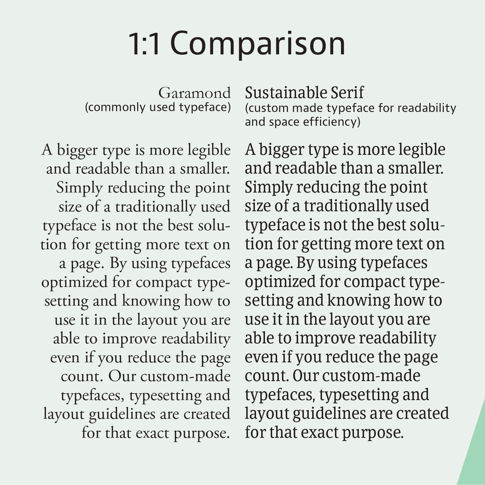
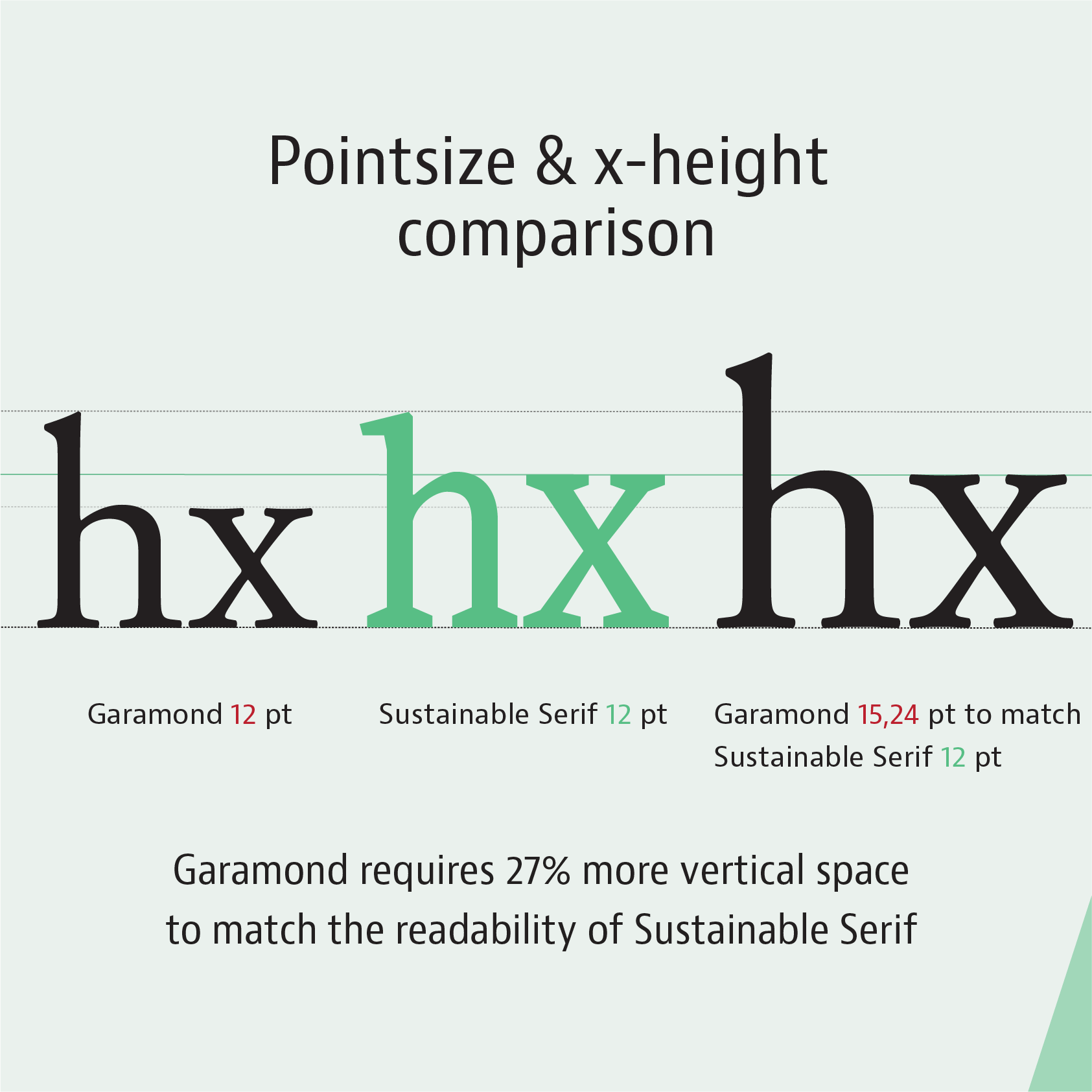
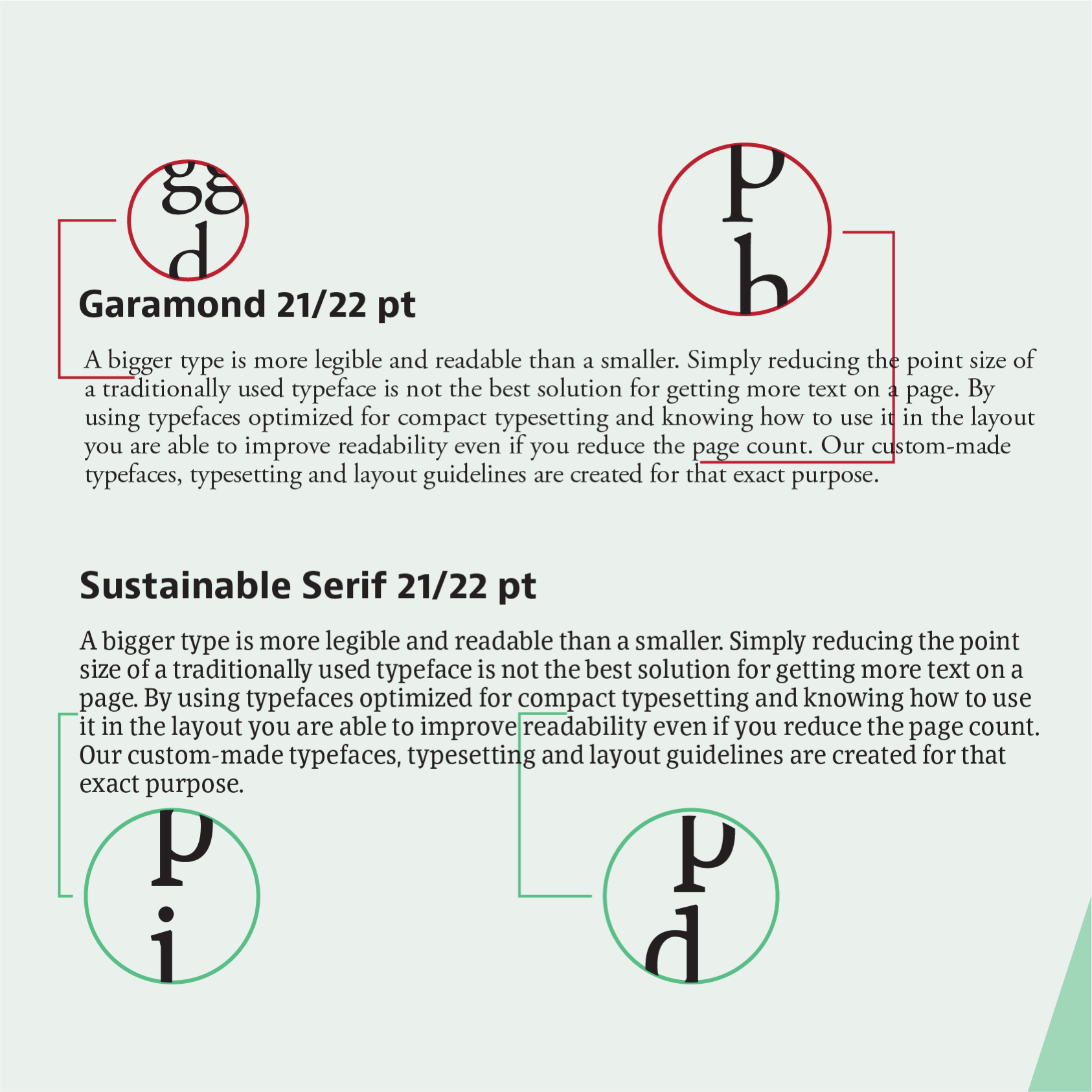
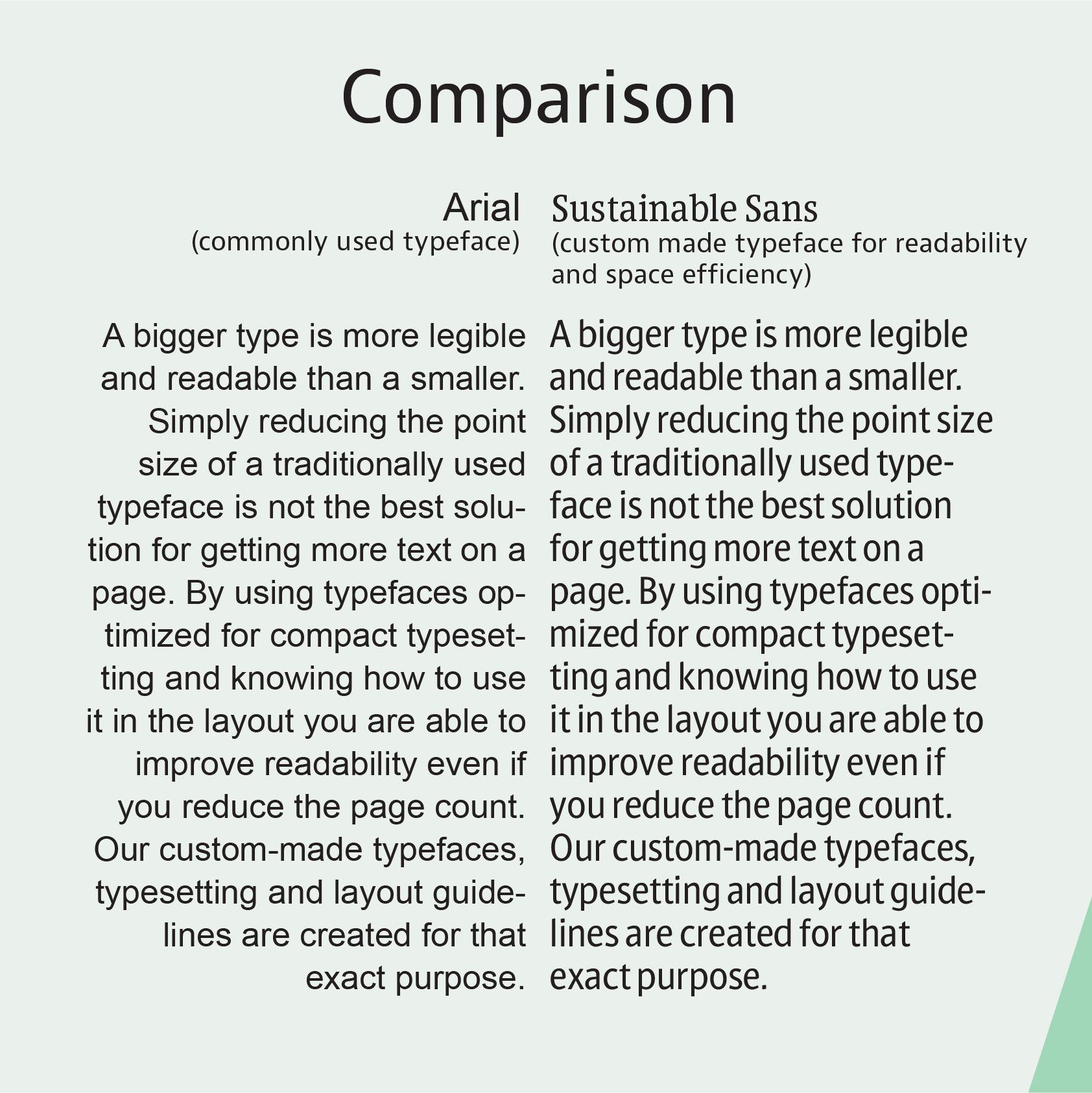
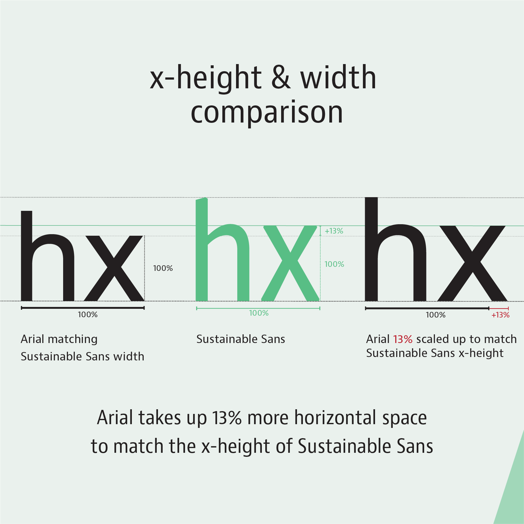
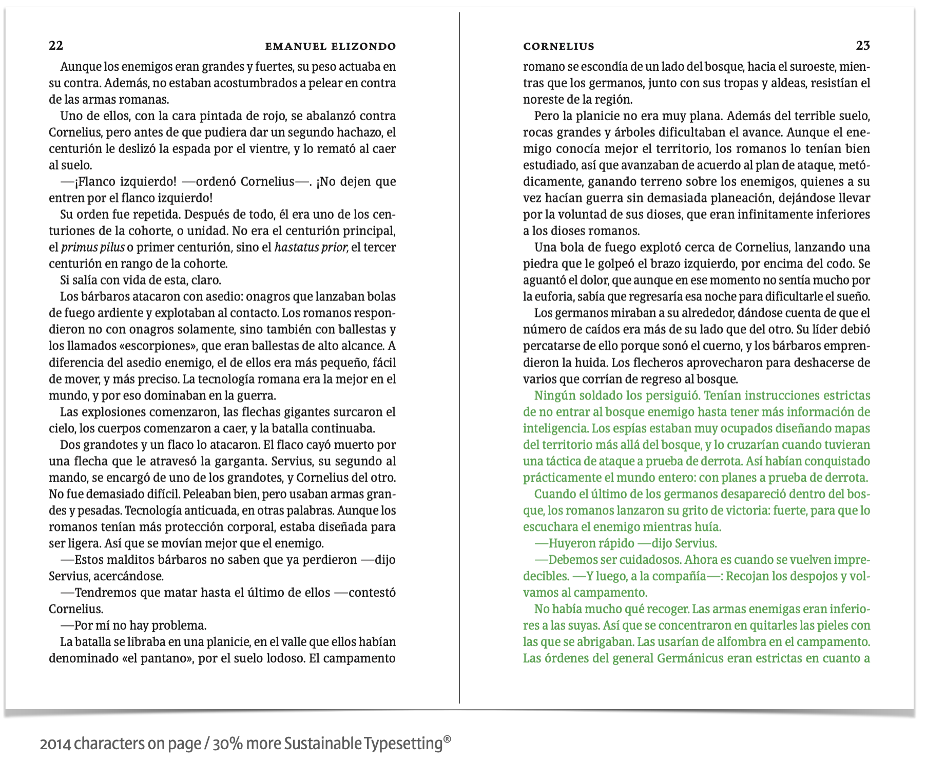
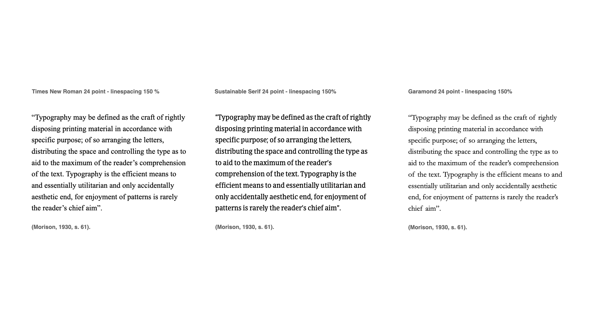
Comparison with industry standards
Readability - Subjectivity vs Objectivity
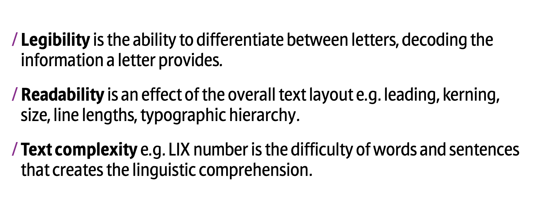
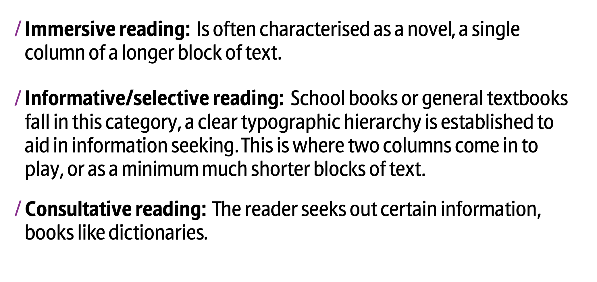
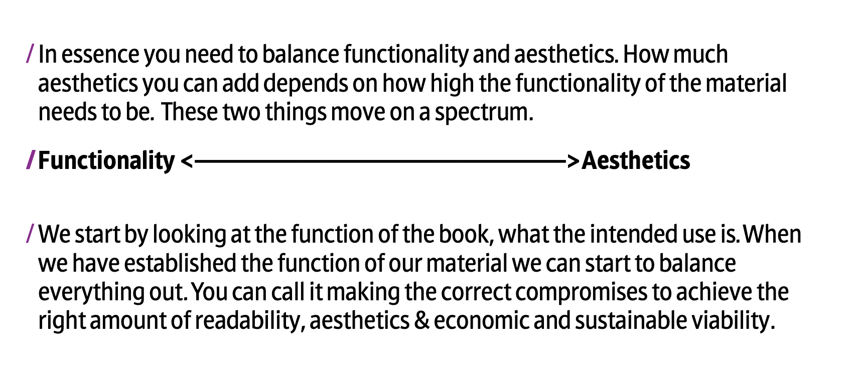
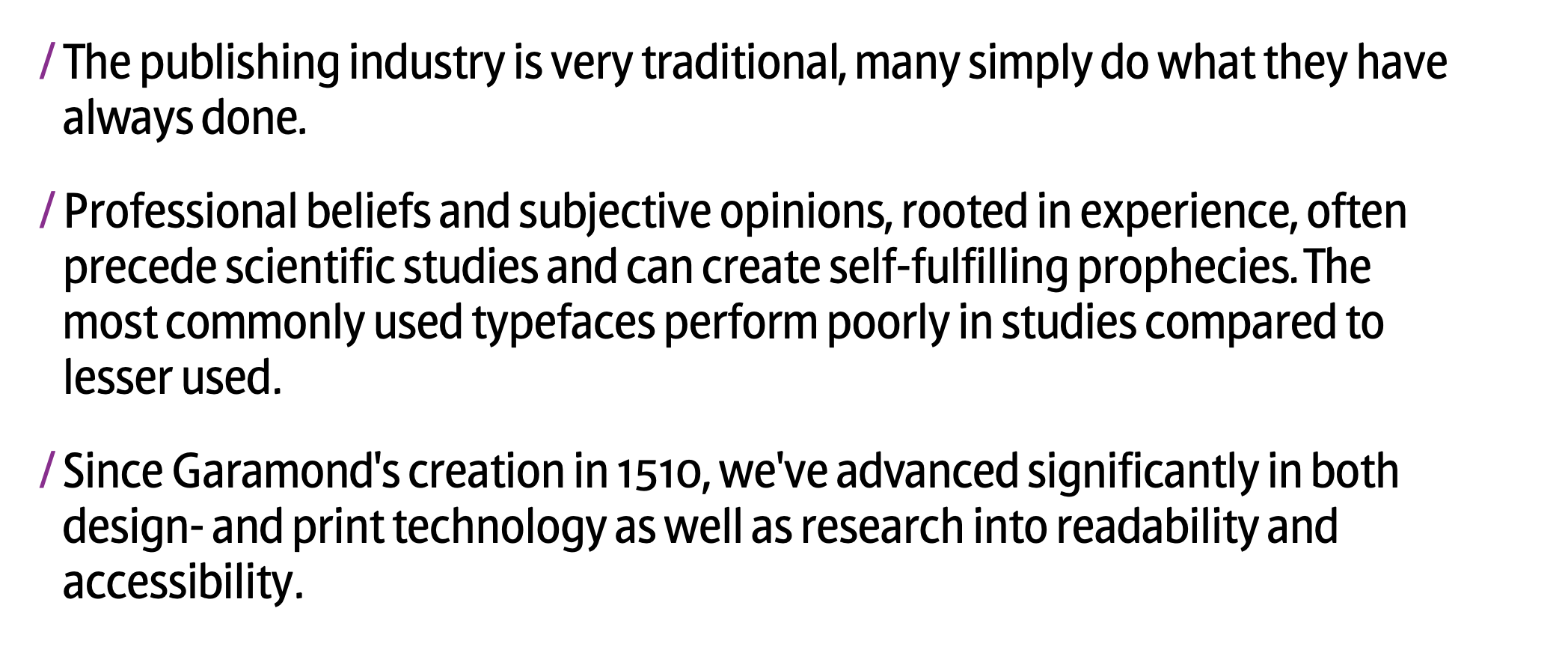
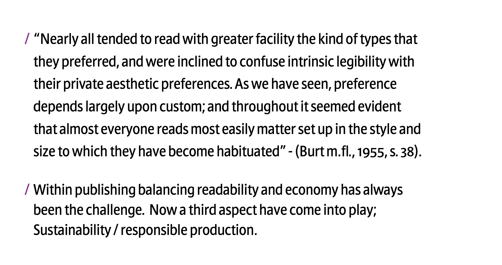
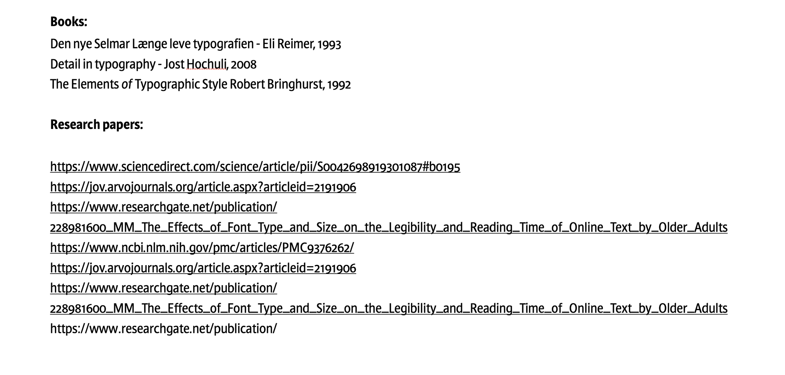
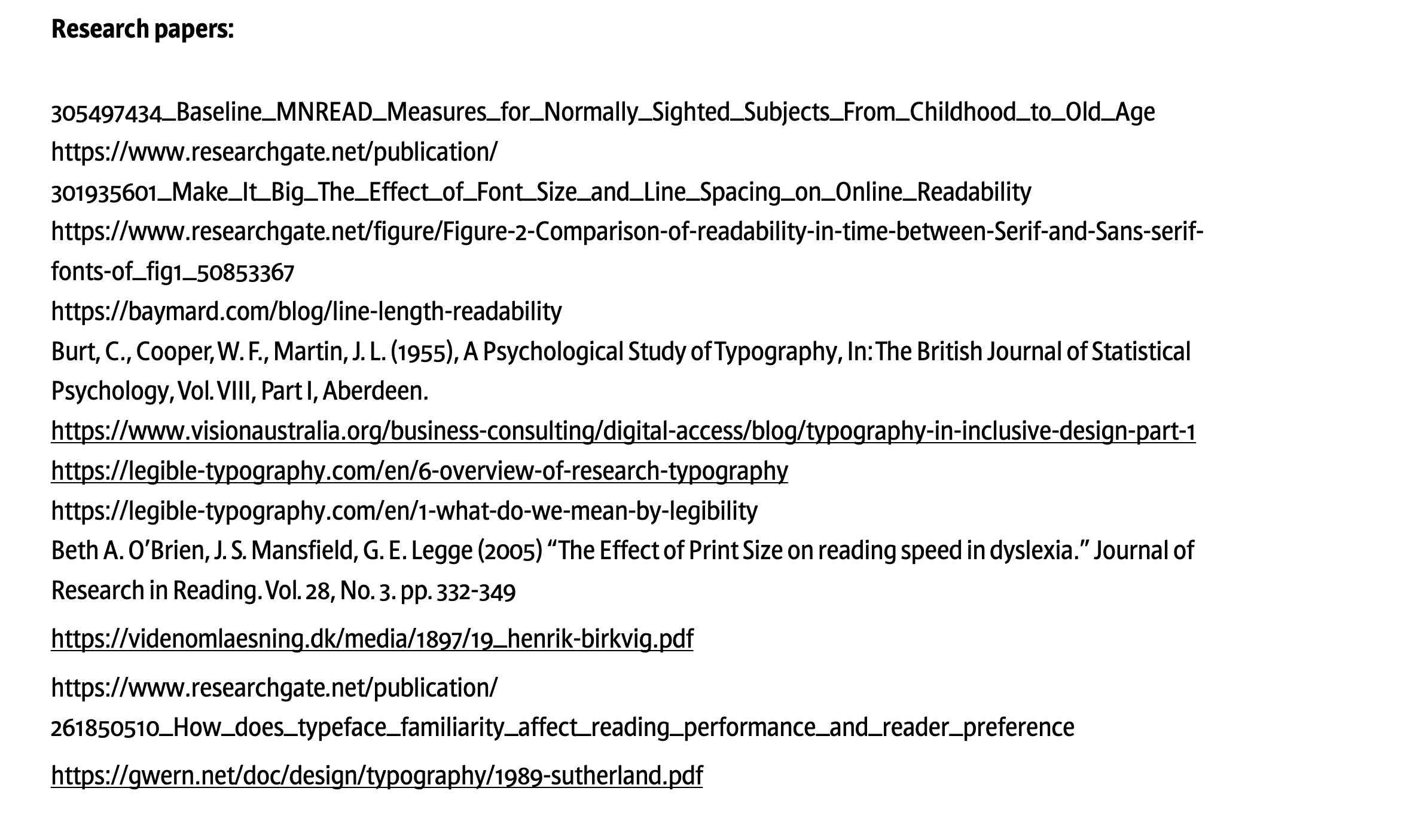
In the slideshow below you will find a summary of what the science actually says about readability & legibility. Some great sources to start with is summarised on the final slide. For an in depth conversation please reach out for us. We cannot explain every scenario here, the best choices and levers to adjust for your publications will be determined on an individual basis.
Before you start going through the slides take a moment to reflect - Do you think your understanding of readability is subjective or objective?
Cloud Reading
Reading is a challenge. To help our lazy brains, arranging typography as predictable as possible, using a logic distribution of white space, is helpful.
Creating an even white space around words helps the reader get into a predictable flow.
This can be achieved by arranging the letter spacing to match the letter's inner forms, creating harmonious letterscapes (words).
Keeping word spaces even and proportional to the letter spacing and keeping leading (line spacing) harmony to ensure an even cloud of whitespace around the words will provide the most effortless reading


